
Rooted in Nature. Quietly Expressive.
Introducing Oat, Olive and Espresso.
There is a quiet confidence in colours that don’t demand attention, but instead reveal themselves over time.
Our newest additions, Espresso, Oat and Olive, are shaped by this idea. Drawn from natural, weathered landscapes, each tone brings a sense of depth and warmth that feels both grounded and enduring.
These are colours that sit effortlessly within a space, supporting architecture rather than competing with it.
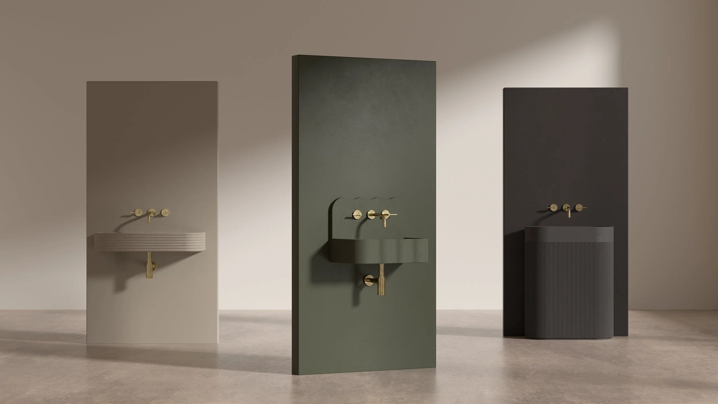
Espresso is deep and anchoring. Inspired by dark timber and rich earth, it introduces a sense of permanence, adding depth without heaviness. There is a calm strength to it, one that allows form and material to take precedence.
Oat offers something softer. Reflecting sun-warmed stone and mineral surfaces, it diffuses light and brings a gentle warmth to interiors. Subtle and versatile, it creates a balanced backdrop, particularly in spaces where calmness and clarity are key.
Olive completes the palette with an organic presence. Muted and understated, it draws from foliage and lichen, introducing a natural softness that feels both refined and architectural.
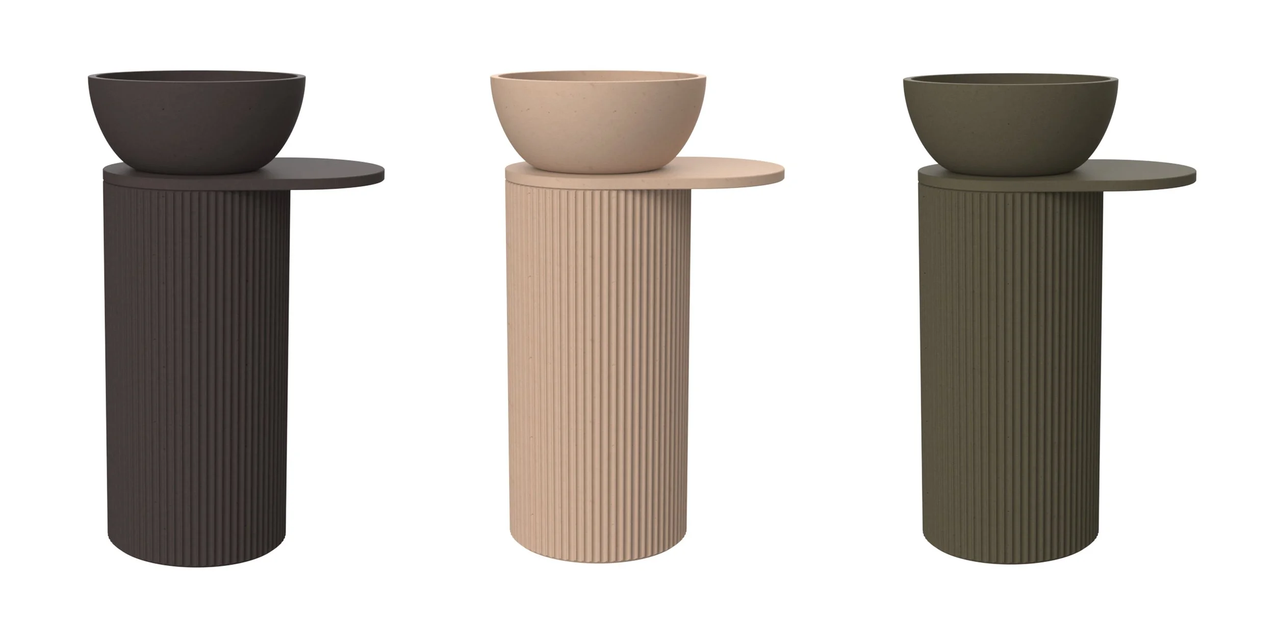
Together, these colours reflect a shift towards tones that are considered rather than trend-led. Designed to age beautifully, they bring a layered, tactile quality to concrete, enhancing both residential and commercial spaces with quiet intention.
Which one is your favourite?